Same, Same but Different
Concept: Bodies of Water
Theme: Identity
Analysing Three Artworks
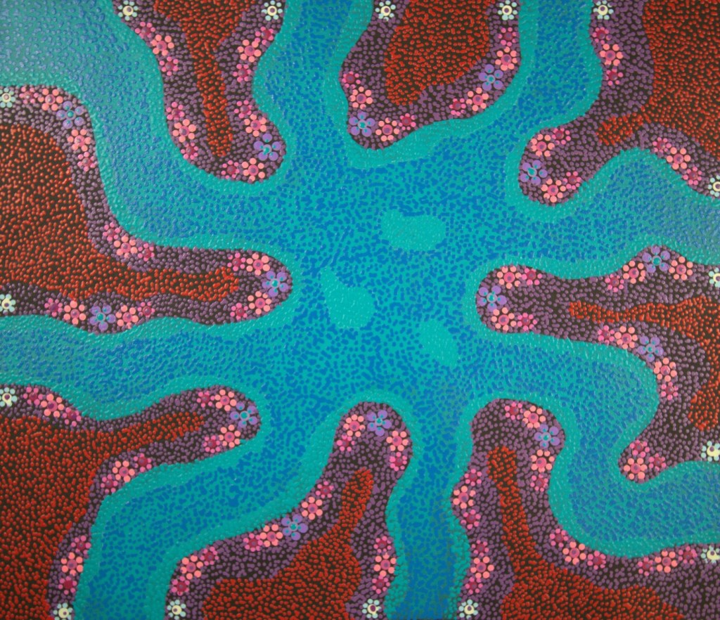
Artwork One: ‘Kapi Piti Waterhole’ by Andrew Tjupurrula Highfold
Initial Though/Feelings: Looking at this artwork makes me feel like I am a part of something bigger and that everything is interconnected. My eyes are drawn to the three shapes in the centre of the body of water and I can imagine one of them is me floating.
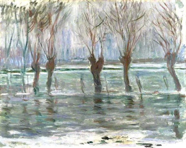
Artwork Two: ‘Flood Waters’ by Claude Monet
Initial Thoughts/Feelings: Looking at this painting makes me feel anxious. My eyes are drawn to the different colours within the water which hide the severity of the damage being caused, despite the calmness in the painting.
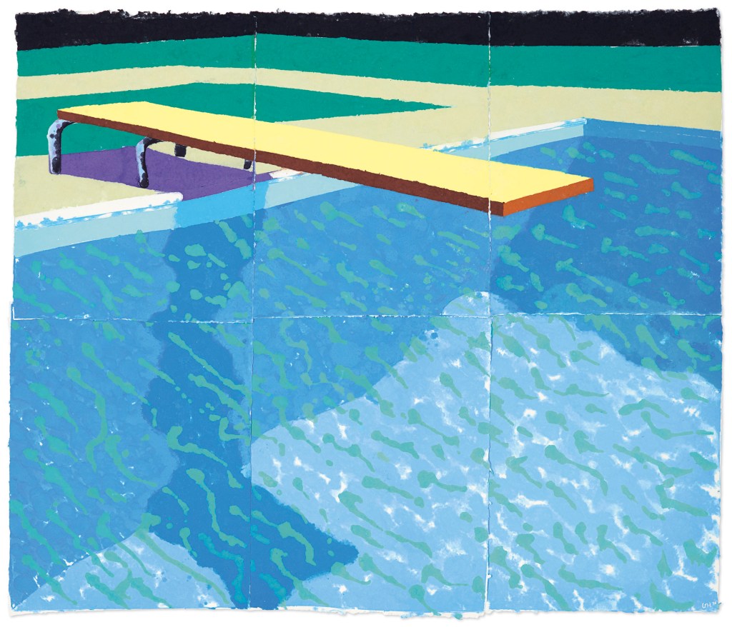
Artwork One: ‘Paper Pool 14’ by David Hockney
Initial Thoughts/Feelings: This artwork makes me reminisce hot Christmas school holidays. I can feel the heat of the cement on my feet and imagine the refreshing feeling of diving into the cool water.
Formal Analysis: Paper Pools
Where is your eye drawn first?
- My eye is first drawn to the water in the pool, specifically the squiggly shapes.
What is represented or suggested? Describe the lines used in the work. Do they create a sense of depth or movement?
- The abstract shapes used suggest that the water is moving.
- Lines are used in the artwork to highlight the shadows in the pool water, adding depth to the water.
Is there a limited range of colours? Which ones are dominant?
- While there isn’t a great deal of colours used, the palette utilised is vibrant and vivid, with the shades of blue of the water being dominant.
Do the colours create a mood, or suggest ideas or feelings?
- The colours bring up memories of hot summer days spent by the food. When I look at the artwork, I can imagine the heat of the cement under my feet and the first refreshing feeling of diving into the water.
Is the artwork mainly light or dark colours?
- The artwork has been created with predominately light colours.
Is the work busy or is there negative (empty) space? Is the work balanced?
- The busyness of the abstract shapes on the surface of the pool water is well balanced using block colours for the design of the rest of the artwork.
Are there any surfaces that are visually interesting or intriguing? Describe what you see or the texture of the surface? Describe the movement or stillness in the work. What elements do you notice created this? Are there repeated elements in the work creating a rhythm?
- The use of abstract shapes on the surface of the pool creates the illusion of movement within the water making it visually interesting. The artist also includes white splotches throughout the water which give it a reflective quality.
Do you know what medium the artist used in the piece? Does the artist’s choice of medium affect the reading of the work? How?
- The artwork is created using paper pulp as the medium which allows the artist to capture the variations of light within the water.
Year 6 Level Analysis
‘Paper Pool 14’ by David Hockney was created in 1978 using a paper pulp medium, which combines printmaking and painting techniques. The work is a striking example of Hockney’s exploration of colour and abstract shapes and techniques. The artwork uses vivid and saturated colours, and there is a repetition of abstract, squiggly shapes across the surface of the pool water. These shapes suggest movement and the reflection of light, creating the appearance that the water is gently shifting in the sunlight. These abstract shapes also generate a sense of movement and depth. These two design features enhance the visual impact of the painting and immediately capture viewers eyes.
The use of the vivid, saturated colours also helps contribute to the light and vibrant tone of the artwork. It gives rise to memories of summer warmth and captures both the physical heat and leisurely mood associated with being poolside. The busyness of the abstract shapes used in the water is balanced by the use of block colours in the surrounding areas. Furthermore, the use of paper pulp as a medium plays a significant role in understanding the artwork. This medium allowed Hockney to capture the subtle variations of light and the shimmering qualities of the water within his artworks, which during this era were primarily inspirated by Los Angeles swimming pools.
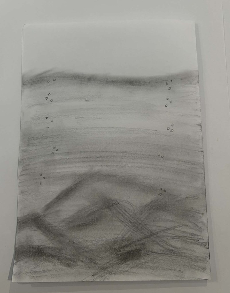
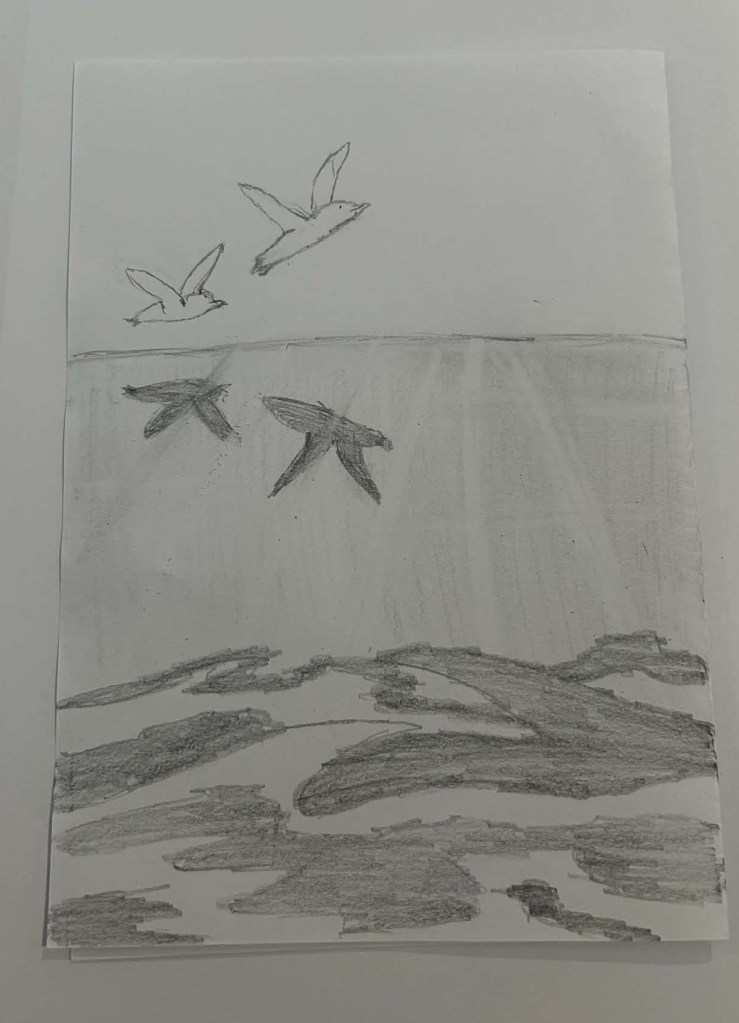
My Drawing Journey: Deep Coastal Ocean
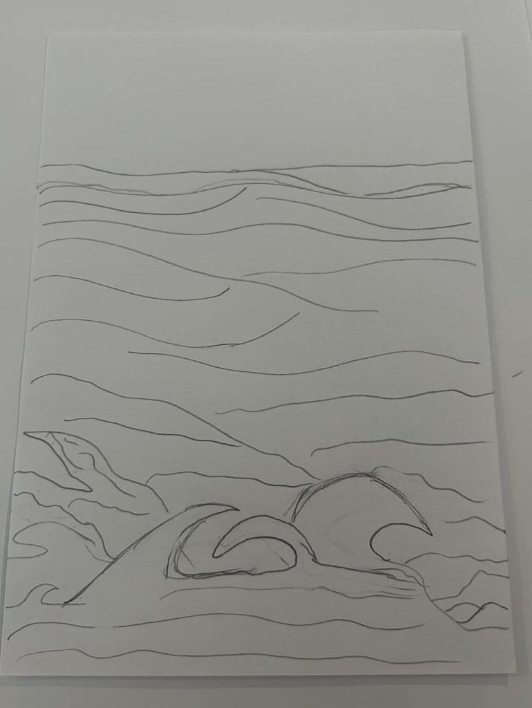
Drawing One: The focus for drawing one was trying to conceptualise the idea in my head on paper in its simplest form. I found it incredibly hard to add any depth to the drawing when using only lines.
Drawing Two: In my second drawing, I focused on trying to create depth through shading and then smudging/blending with my finger. On reflection, I felt this was effective as creating more depth for the artwork but also made it come across as darker and angrier. After reflection, I also experimented with adding little bubbles into the artwork to increase the lightness of the overall tone.
Drawing Three: In my third drawing I focused on combining line work and shading to create both depth and the illusion of reflection in the water. When viewing the final product, my initial thoughts are that the underwater currents look more like coral and that the artwork could have benefited from some of the smudging techniques utilised in drawing two. I felt the use of the shading and eraser to create the illusion of sunlight entering the water was surprisingly effective and likely a technique I would use again.
My Creations: Deep Coastal Ocean
My Identity: I am not the stormy chaotic ocean but more like the vast, steady sea. Most of the time I am calm, consistent and have strong reflective qualities. I am not often moveable, but also not passive and when triggered can be reactionary. Like the ocean though if you dive deeper beneath the surface, I have a current of deep emotions and thoughts that are constantly at play swirling where they can’t be seen.
The focus concept for my art creations was bodies of water and the underlying theme that I was exploring was identity. I chose to create three artworks that depict deep coastal ocean as I feel it is a body of water that shares many of the same traits that define my identity. When creating my artwork, I tried to capture multiple key aspects of my identify and personality. Each artwork focuses on having a calm surface and as you dive deeper you discover the currents that are representative of my thoughts and emotions.
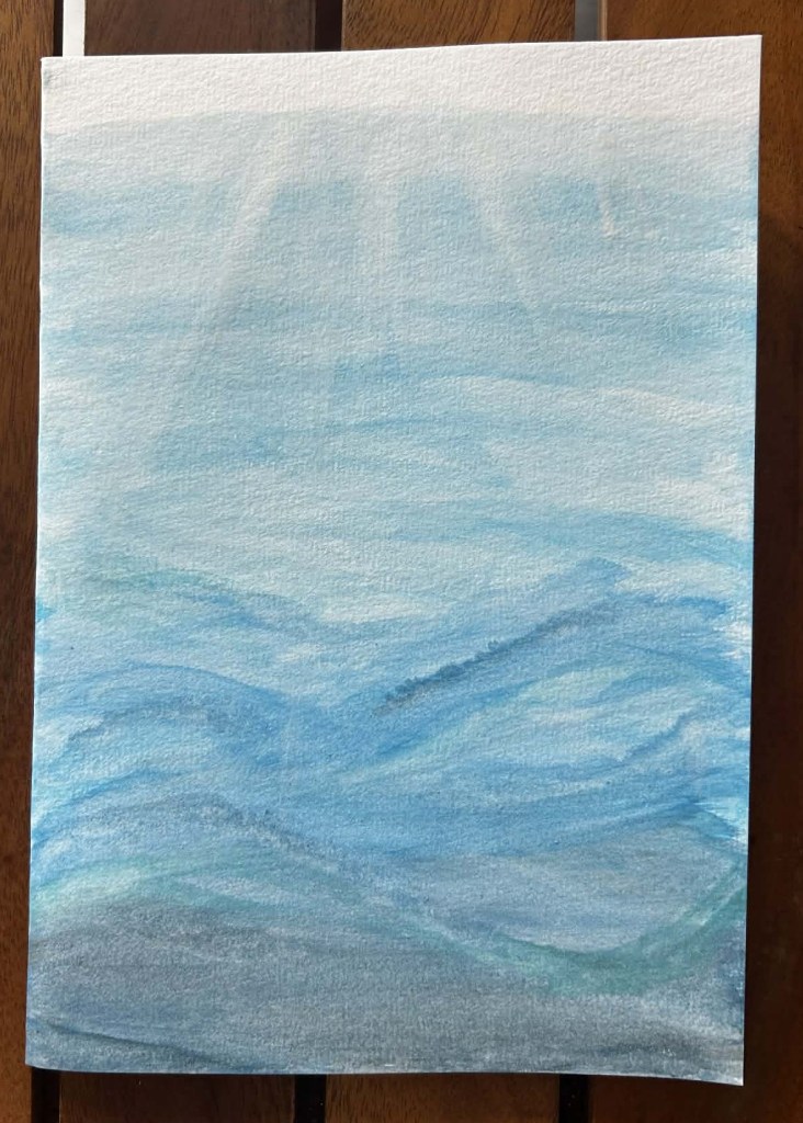
Arts Creation One: Deep Coastal Ocean Watercolour Painting
Reflections: Creating this water painting was incredibly fun. Initially I found it challenging to create the gradient of colour to signify the increasing depth of the water. Once the gradient was complete and dried, I then added further colours to enhance the illusion of the underwater currents as well as the sunlight piercing through the water surface.
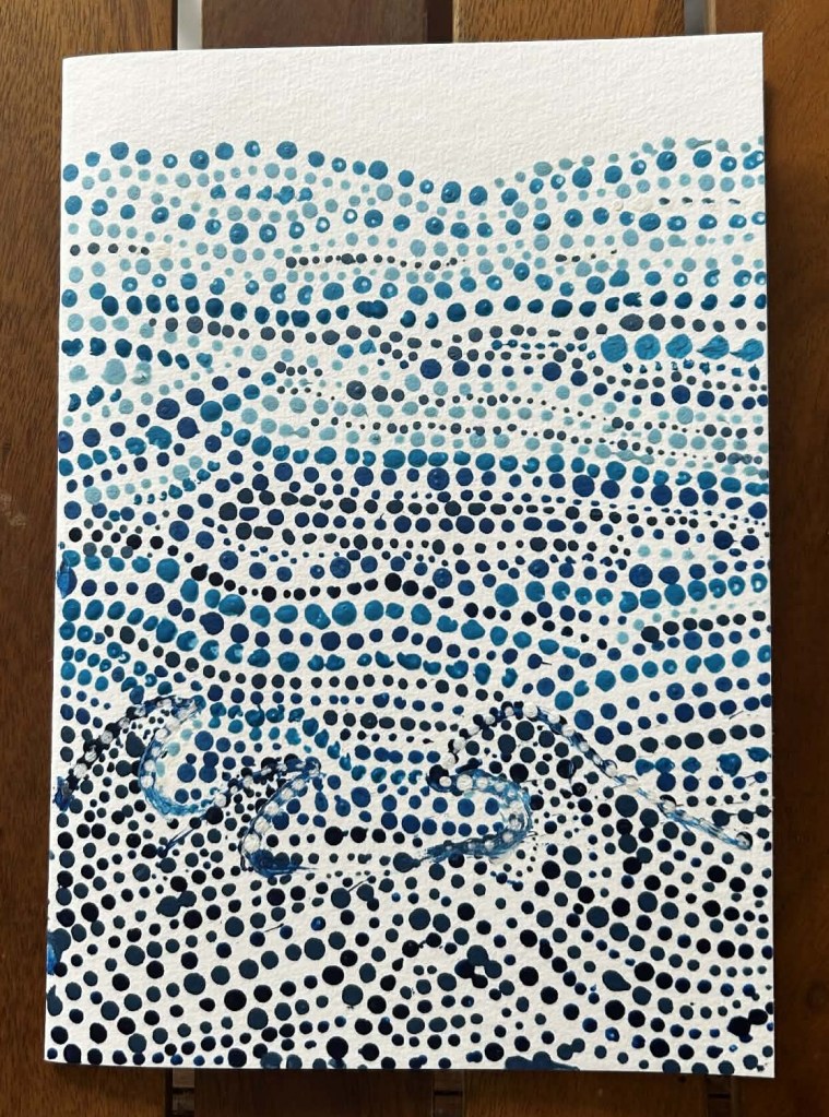
Arts Creation Two: Deep Coastal Ocean Dot Painting
Reflection: I found this dot painting incredibly challenging to create and a test of my patience. I tried to use a variety of dot sizes, similarly to what I observed in the ‘Kapi Piti Waterhole’ artwork by Andrew Tjupurrula Highfold. The artwork was created based of my initial line drawing sketch. I feel as though the artwork could have been improved by using better equipment, so that dots could have been uniformly circular. While the colours created the gradient I pictured in my head, I felt on reflection that the currents under the water could have been improved through the addition of a larger variety of colours (i.e. dark green, purples and maybe some lighter colours for depth and illusion).
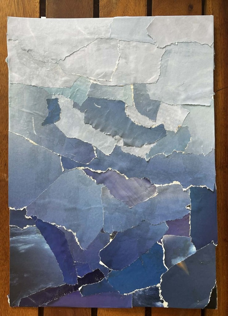
Art Creation Three: Deep Coastal Ocean Collage
Reflection: This artwork was created by recycling old magazines. The pieces used were intentionally ripped up to create raw edges, giving the illusion of movement within the water. As the water gets deeper the intensity of the collage increased to signify the deeper currents. While not photographed well, the magazine pages used to create the top layers of the ocean were chosen as they have white streaks through them creating the illusion of light reflecting on the water surface.
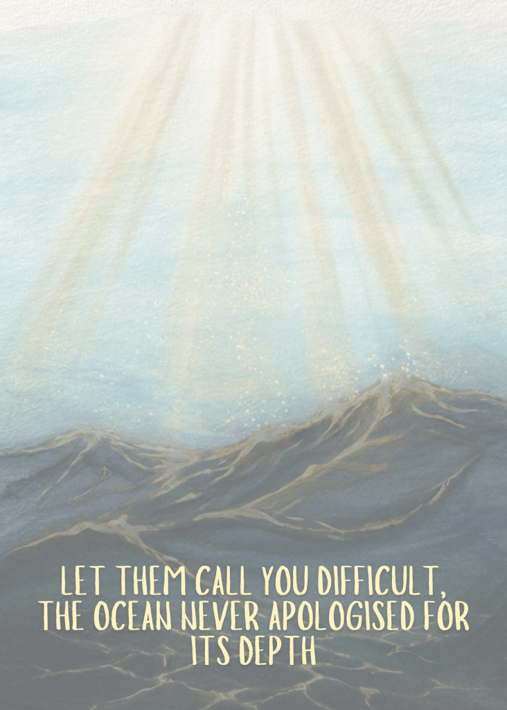
Extension Task: Motivational Print
Motivational print created using my Deep Coastal Ocean Watercolour Painting. The artwork was edited using online software to make the underwater currents more prominent, increase the impact of the sunlight through the water and highlight the reflective properties of the water.